This is my completed final draft digipak. In this digipak I
have included a catalogue code at the bottom of the spine, I have included this
because it is a unique code, which is used for practically all CD’s made to
distinguish it. I have also spent care into lining up borders and texts to give
a more accurate look. I have decided to stick with a simplistic look because I
used this look for the band during my AS level coursework. The simplistic look
suited the band and also can be seen to follow conventions within the genre and
similar genres too. The features involved are also minimalistic for the same
reason. Bands like Foals, The Vaccines and The Black Keys all follow this
method, although they have used images, I felt it would be hard to use an
image, which is suitable to the band and works perfectly with the cover,
especially with the time we have. I would want to put a lot care and precision
into an image, which is very time consuming.
To continue I have included the colour scheme used with our
logo in the digipak. This is so the audience can make connotations between the
colours and our band, which can be seen as a useful technique. However I have
added white into the colour scheme to make a Teal, Black and White three-way
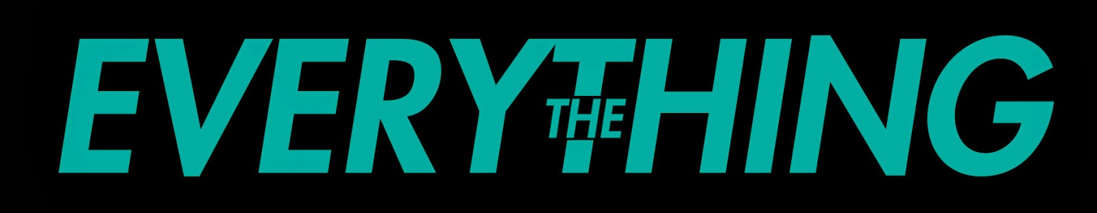
colour scheme. Furthermore I have used the font ‘Bebas Neue’ instead of the
original creations where I used ‘Century’. This is because the font is thicker
which works better with the thick underline used on the cover, and as borders
in contrast to the thinner font and thus creates a more professional look. The borders
have been used throughout each slide to add a sense of continuity to the digipak.


I have followed similar conventions for my music
advert/poster. I have kept a minimalistic look; this can show more continuity
throughout the two pieces, which can be seen as an important feature for a band
to have. Yet again I have involved the colour scheme we created for the band in
my advert. I have used the teal to highlight important information that will
intrigue the audience, for example the album name. I decided to use waved lines
like Swim Deep have in their simplistic album covers and posters. However I do
not own this image and therefore in my final piece I will take time in creating
a similar pattern so I can include it. I have used our band logo at the top of
the poster to portray the bands name; yet again the audience can then make
connotations with the band and the colour scheme used. Yet again I have used
the photo ‘Bebas Neue’, the bold capital writing suits the cover. This is the
only font I have used to keep a professional look throughout both pieces.
Furthermore I believe the lines I have included above and below the key
information in the last third of the poster are effective, they add emphasis on
the information provided inside. I chose to include the key information in the
final third of the cover, as I believe it looks most satisfying to the eye
here. After seeing our logo the audience will instantly be lured in and study
the whole poster, the teal writing in ‘Troubled Town’ does enough in itself to
draw the audiences attention to that and the information around it.